The challenge
Leeds College of Music is a progressive conservatoire. It offers the traditional benefits of one-to-one tuition, but balances that with a very personalised course that reflects the talents, needs and interests of the individual student. Alongside this, the college provides an atmosphere that promotes collaboration, and takes great pride in its students’ work. LCoM were looking to update their visual identity to reflect these principles.
The solution
In collaboration with Karsten Schmidt, Precedent developed a generative identity to showcase the diversity of talent within the college and reflect each student’s personal work.
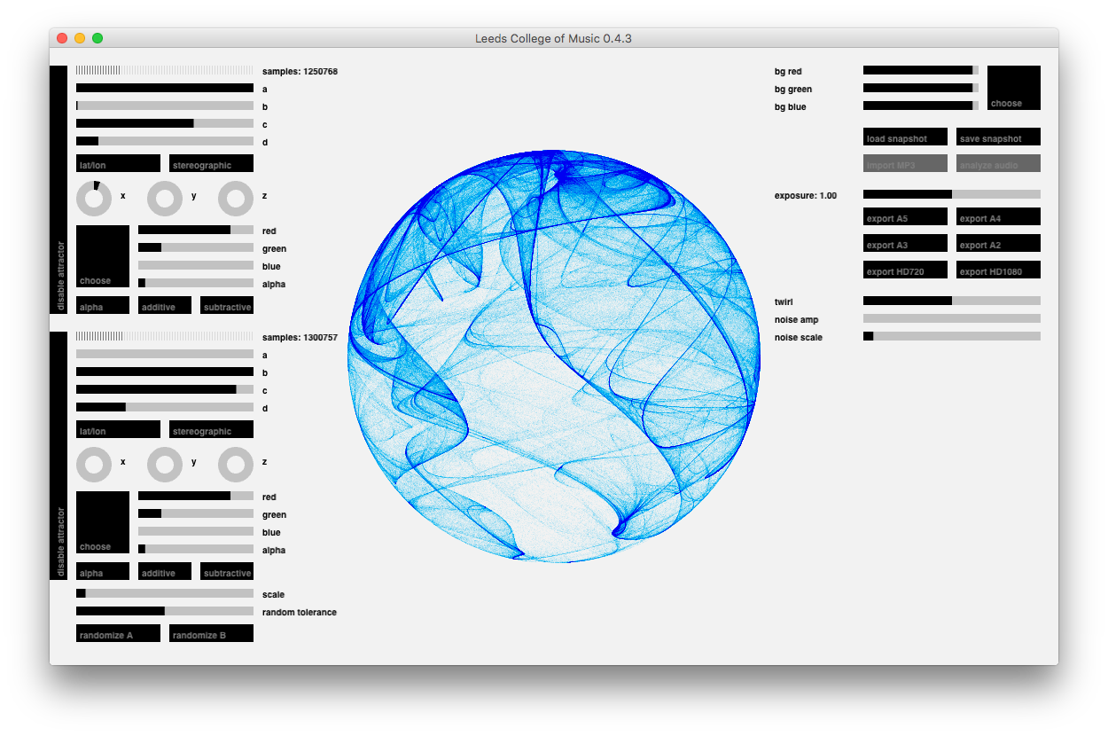
A piece of bespoke software allows the college and its students to render a reactive visualisation of a piece of student music within a set of parameters based upon the core visual mark. The original mark represents the college itself – facilitating the student’s journey – and it is the combination of student and college that leads to the final visual output.

How we did it
I was part of the team behind this brand identity, primarily working on generating marks, testing them for the necessary applications and designing items of print collateral.

Testing printed applications
I made a daring and initially quite startling typographic pairing choice to marry a very circular logo with a very angular, condensed font, but the LCoM team have taken the brand we defined and have produced some visually-stunning work with it.
It has also been reproduced in foot-high lettering on the side of their building in Leeds to great effect.

I spent time carefully tweaking values in the bespoke software to create the final assets
I also took on a more technical role, working directly with the software and its preference files, then testing its output to ensure that whether on-screen or printed, the graphic mark could be reproduced at a consistently high quality.

