The challenge
For the 2015 UK General Election, the BBC required a responsive guide to each party’s stance on a series of key issues, so that people could make a factually-informed decision about which party to vote for.
The solution
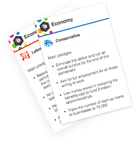
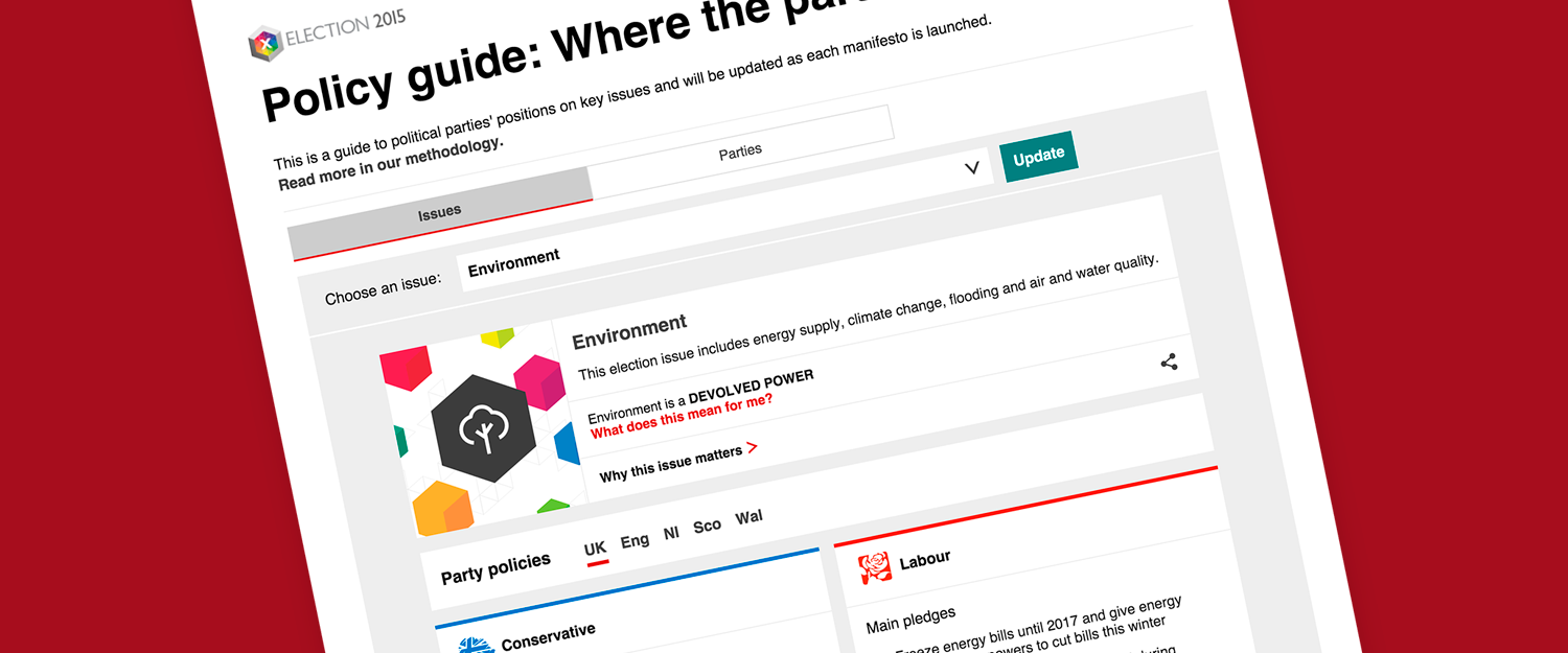
The end result consisted of a section within the Election 2015 site where you could view all parties’ policies and filter these by issue or by party, as well as embeddable versions of each policy ‘card’ to be placed in stories throughout the News website’s daily election coverage.
Visit the BBC’s Policy Guide to experience it for yourself.
The process
Definition & architecture
From very early on, we established that previous versions of this guide weren’t going to perform well on devices with smaller screens as they were created at a time when the vast majority of the audience were browsing on desktop or laptop computers.
As a significant proportion of our audience are now browsing on portable devices with a variety of screen sizes (and often while on the move) we wanted to offer them a much more appropriate experience.
This helped us establish some clear goals:
- It must be responsive (and preferably approached mobile-first)
- It should allow users to quickly assimilate a lot of information
- It should be simple and quick to navigate
- It should allow users to easily compare the stance of multiple parties
We arrived at the metaphor of a single card per policy as it allowed us to treat each as an individual entity, but also to display a series of policies together, using contextual filtering based on the user’s choice of topic and nation.
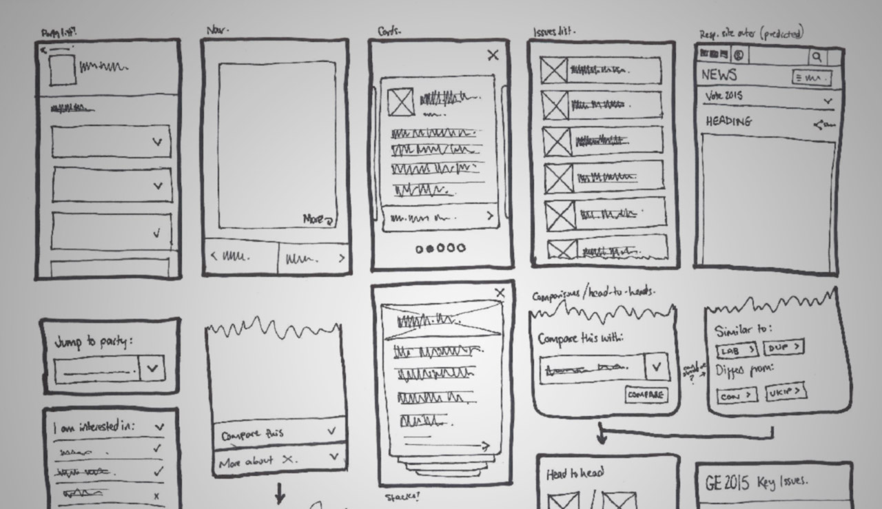
Sketching early ideas
Treating the content as modular pieces also opened up the possibility of presenting the information in a way that it hadn’t been used in the past – bringing together a party’s summarised policies as a bite-sized mini manifesto.
Alongside these collections of policy cards, we intended to present additional contextually-relevant information such as a short introduction to each issue, links to more in-depth information and whether or not it is devolved in Scotland, Wales or Northern Ireland (and the resulting implications of this).
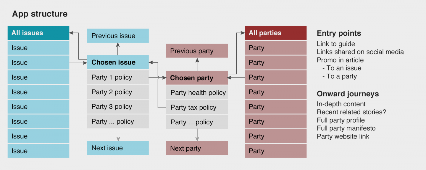
Early draft of user journeys through the web app
Wireframes & prototyping
After defining the structure of the app, the next task was to define the exact content, interface and interactions.
I created a set of wireframes with the indicative content structure to be revised after stakeholder feedback, but did this in tandem with exploring methods of navigating between issues so that any changes would be reflected in final wireframes for sign-off.
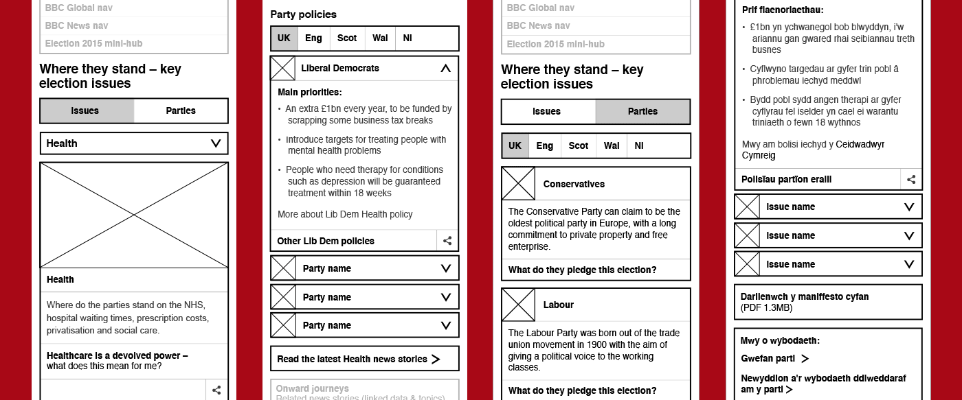
Wireframes in English and Welsh to cover both editions of the guide
From early on in the project, the idea of swiping from issue to issue was suggested as a mobile-friendly interaction, so I coded up a quick prototype to test how this behaviour performed.
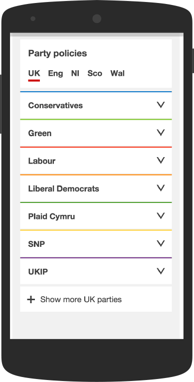
HTML prototype used for user research sessions
Trying it out for ourselves with a few of the key user journeys, we soon realised that it was forcing a very linear navigation through the app and not allowing us to explore issues in an order based on our preferred areas of interest, so we revised this to a dropdown menu for testing with users.
Testing with real users
We recruited a group of people across a range of ages with differing levels of political interest and technological competence to try out the guide.
By asking the participants to complete a series of tasks involving the key use cases for the app, we discovered which parts were working well (and which weren’t).
We then took the results of these tests into account when polishing the final designs for the app, making changes where appropriate.
Branding
In addition to defining the structure and behaviour of the app, it was also my task to add visual elements to tie into the wider Election 2015 brand.

Developing the hexagon-based Election brand
After trying out a range of ideas, I settled on a series of cubes surrounding a central hexagon (both elements of the main election logo) to represent the parties with their policies and different positions on any one issue.

Examples of the randomly-chosen backgrounds
In the interest of balance, I created a range of image assets with these shapes, each showing a different range of colours and chosen at random by the app to ensure that one party’s colour is not tied too closely to a particular issue.
Prototype exploring animation of brand elements
In the process of exploring the branding, I also coded up a quick prototype using Processing to automatically generate randomised cubes across a canvas. This then became the inspiration for the background of the News Channel’s election touchscreen, further linking the TV and online election coverage.
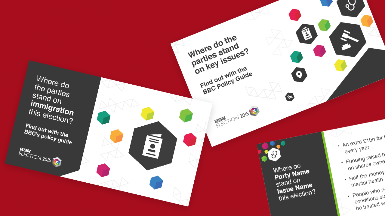
Examples of social media promotion
As well as this, I created a series of promotional images to be used on social media. These ranged from straight promotion to snippets of content with clear calls to action to explore more in depth.
These were also used by key social media accounts at the same time as the televised debates to add to the online conversation.
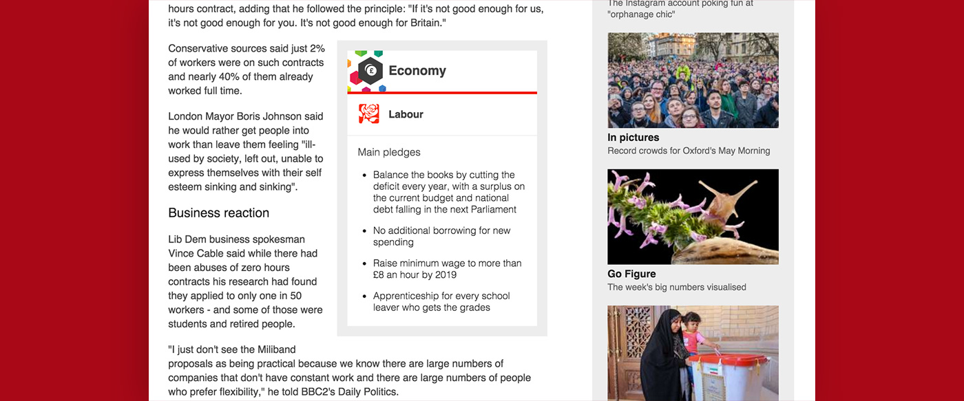
A single policy card being used as context for a story
Outcomes & performance
We kept an eye on social media coverage of the app, which was very well-received and positive. In a lot of cases, users were pointing friends and family to it for clarity, or as a simple, reputable source of fact.
As an on-the-fence voter, the @BBCNews Election Policy Guide is brilliant.
– Twitter feedback
Usage of the app (particularly on mobile devices) also peaked on polling day, suggesting that it’s likely that users were checking policies before voting, and it spent a large portion of the day as one of the most-read pages on the BBC News site.

