The challenge
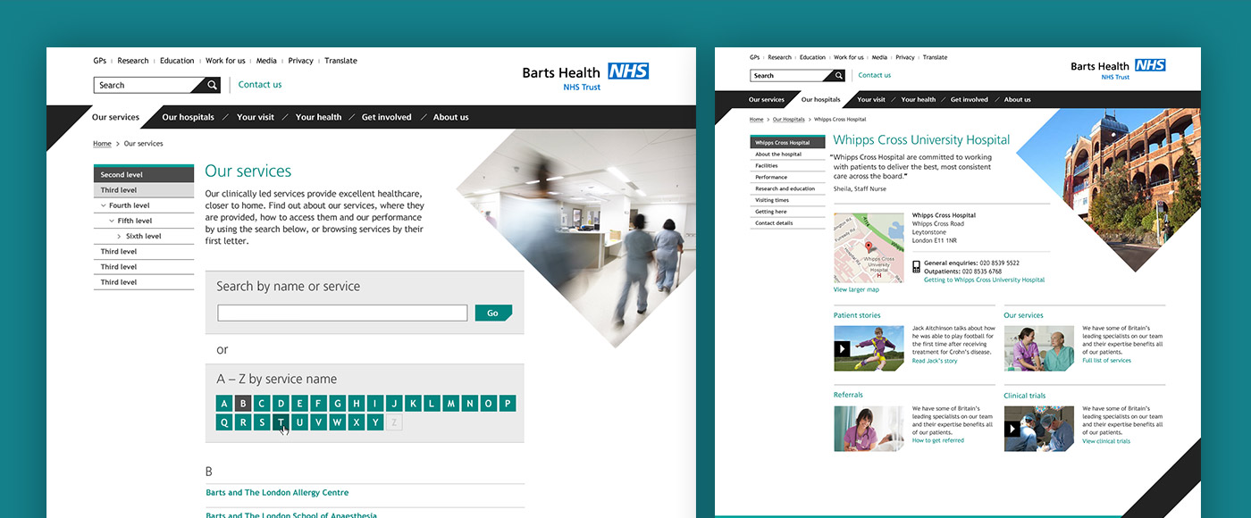
Barts Health NHS Trust consists of 6 hospitals in East London, with 15,000 staff serving a population of 1million people in their local area. Following on from a brand identity refresh by Glazer, it was my job to take the new guidelines and design a clear, bold and accessible website to complement the new look.
The solution
A visually-clean but information-rich website, aiming to provide simple, legible information.
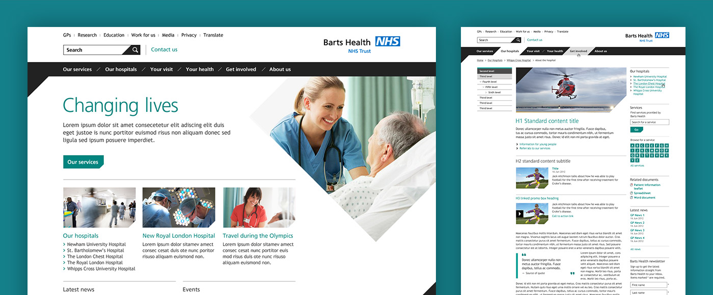
While there are simple graphic flourishes to retain the look and feel of the brand, the primary objective for this site is to provide clear – and potentially vital – information. I approached this by establishing a strong hierarchy of type, designing a grid aimed at keeping line-lengths short and legible, and subtly altering brand colours to ensure they passed WCAG2.0 AA accessibility guidelines.
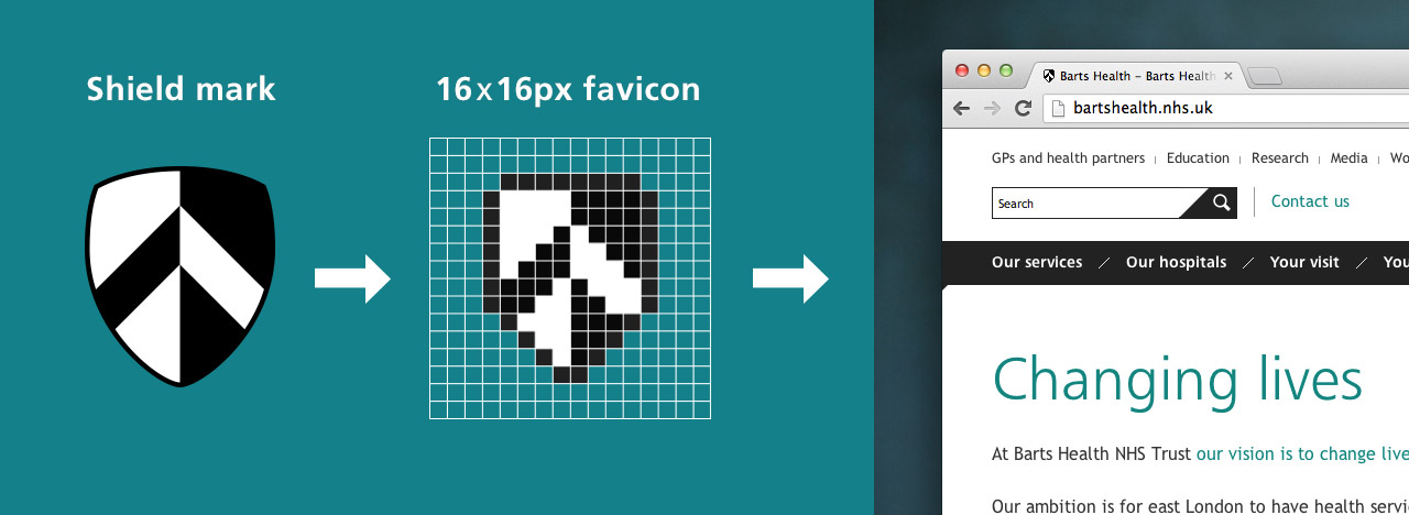
Crafting a 16×16-pixel version of the shield mark
Working with such a striking and confident identity posed its challenges, such as implementing 45 degree angles while retaining support for earlier browsers, but by keeping large panels of black to a minimum and using large photography the site retains the friendly face of Barts Health.