The challenge
Take a complex dataset and present it in such a way that people can easily input their job, find out the likelihood of it being automated and want to share their findings with others.
The solution
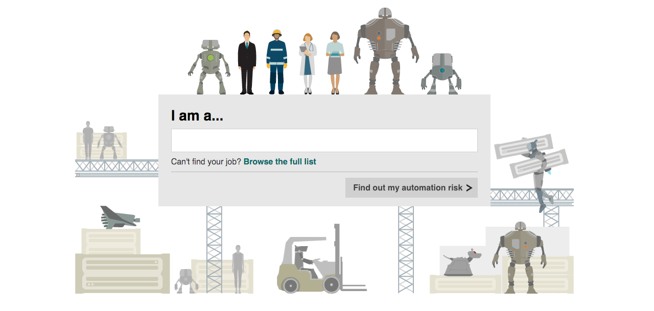
We used a combination of autocompletion and synonyms for popular jobs in the database to make the job searching process as smooth as possible, alongside animated illustrations to add visual interest to a very functional page.

The process
My contribution to this piece was in two parts – trying to make the process of searching for your job as intuitive and smooth as possible, and investigating whether we could use animation to liven up the page.
3% likely! Nice try, robots!
– Twitter user
Defining the job search behaviour
As this article was to be presented in one of our pre-defined templates, the main UX task was to make the dataset simple to explore.
As a team we quickly identified that presenting the jobs in the categorised format in which the data was provided would be likely to cause confusion for users in knowing which category to choose before finding their job. We also avoided presenting the whole dataset in a single select element, as that would have been unnecessarily long.

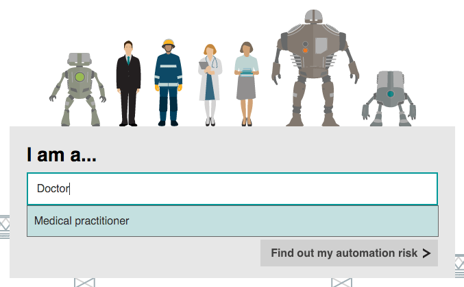
One example of synonym use
To combat both these concerns, we made the whole dataset searchable using an autocompleting text field. As a lot of people tend to refer to certain jobs by less formal names than those in the dataset, we added synonyms such as ‘vicar’ for ‘clergy member’ and ‘doctor’ and ‘nurse’ for ‘medical professional’.
Giving users the chance to explore the full dataset for themselves
As an aside to the main goal of finding a specific job, we wanted to enable people to find other jobs they were interested in (be that those of family & friends), and see which other jobs are equally likely to be automated.
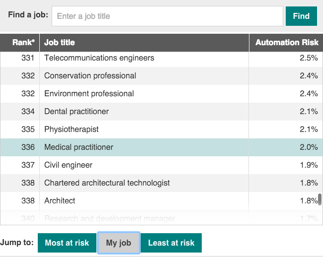
To do this, we presented the full dataset as a scrollable list, ordered by risk. Given that the dataset was so large, it could be quite unwieldy to scroll through, so I worked up a prototype with extra navigation controls to test how it worked and try to refine the experience.

The full job list, with buttons to jump to key positions
Adding buttons to scroll to the top, bottom, and the user’s job made for much faster navigation, but introduced a different problem – rapidly scrolling lists can be visually jarring, and even appear to scroll backwards if the frame rate is slightly mismatched to the rate of scroll.
I investigated options to help this, and arrived at fading the list to a lesser opacity while it rapidly scrolled and then back up to full opacity as the movement ended.
Using animation to enhance the look of the page
Once the functional work was done, then came the fun part. I took illustrations provided by the highly-talented Gerry Fletcher and used his vector design files to produce a series of SVG files to be manipulated with code.
The most detailed section was the top banner. I prototyped a static scene, then progressively enhanced it using CSS animations for browsers which support them. This meant that everyone got a rich, core experience but didn’t limit the experience of users with more capable browsers.

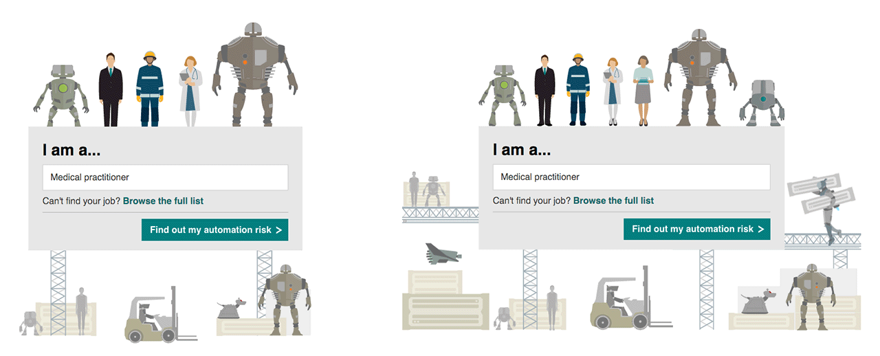
How the main animation simplifies on smaller screens
As there was a lot going on in the full scene, I combined the SVG files with CSS media queries to simplify the level of detail for smaller screens by removing elements from the scene.
Making sure page performance wasn’t affected by the animations
Another of the key animations on the page was that of a human becoming more or less android-like depending on the percentage chance of job automation.

One of the key animations
As before, we used a series of CSS animations as progressive enhancement to create the effect, and used 3D CSS transforms to make the most of GPU acceleration where it was available, keeping the movements smooth.
While this worked successfully for the illustrated humans, I quickly worked out when testing the animations on a range of devices that the main banner illustration was appearing choppy on older devices.
To combat this, I separated the animating elements from the background of the scene and placed them in separate SVGs, animating them individually rather than together. This greatly improved performance, as the browser can render each as a separate layer, and minimise the amount of the scene that needs to be redrawn for each frame.
Promoting the piece
To complement the animated page, I also took two of the robots and animated them carrying out a couple of jobs from the study (in a slightly clumsy, robotic fashion, of course!)
Social media promotion examples
