The challenge
The MU came to us with the aim of streamlining their membership signup process and updating the look of their site at the same time.
The solution
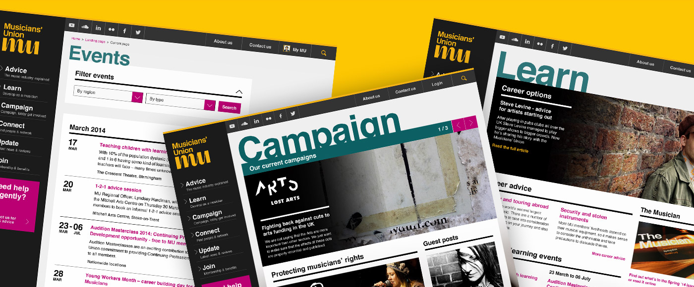
Through prototyping and testing a series of options with real users, we provided a refined experience for new members, and refreshed the overall visual design.
The process
This project consisted of two (admittedly closely-linked) parts, but they were tackled alongside one another to make sure that changes to the site made in one, didn’t affect the other.
Taking an in-depth look at the signup process
Over a number of years, signing up for the MU as a new member had become rather long, and we were briefed to refine the process into as few steps as possible.
To do this, I worked closely with UX architect and strategist Darren Amer, who identified the key pieces of information required from the process through discussions with the MU team.
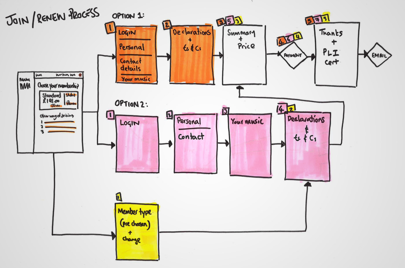
Sketching to define the various steps in the process
Once these had been identified, we both sat down for a collaborative sketching session, to group the necessary fields as logically as possible, split the groups into a handful of thematic steps and identify two variants to be tested.
I then took our ideas and some early design elements from the visual design work and produced a responsive HTML prototype. We then tested it in a series of rapid research interview sessions with both existing and new members.
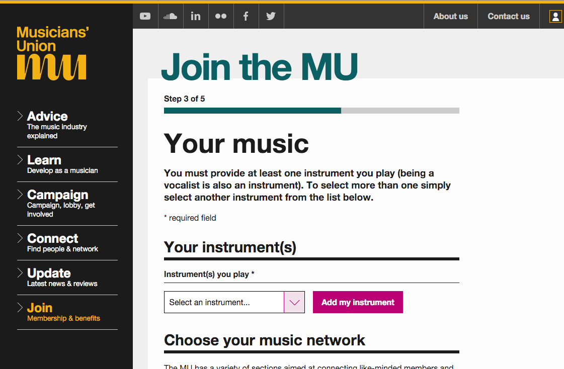
One of the screens we tested with users
As the brief for the project specified that the site should be responsive, we included large, easily-tappable form elements and tested the pages on a range of devices.
We also placed a prominent progress bar at the top, to give potential new members a very clear idea of where they are in the process.

Making the progress bar prominent to set user expectations
To make the testing more realistic for the participants, I wrote a short snippet of Javascript to ensure that the personal details they entered were remembered from page to page in the testing process. These were then displayed in full on the summary screen to make sure we were testing the page with accurate content and not confusing the participants with unfamiliar dummy data. I’ve written about some of my thoughts surrounding this in a post in the experiments section of this site.
From the testing process we learnt that some of our messaging around choosing multiple instruments was ambiguous, and the length of the suggested instrument list was proving a sticking point for people trying to complete the process, so we took these things into consideration when refining the designs.
Updating the visual appearance of the site
The other half of the work involved updating the look of the site. In their print collateral, the MU had very successfully used their brand assets to craft a very strong and easily identifiable aesthetic, but this wasn’t being replicated on their site.
Taking a lead from their brand guidelines and existing print materials, we identified that larger type, more confident use of photography and a richer colour palette would tie the two more closely together.
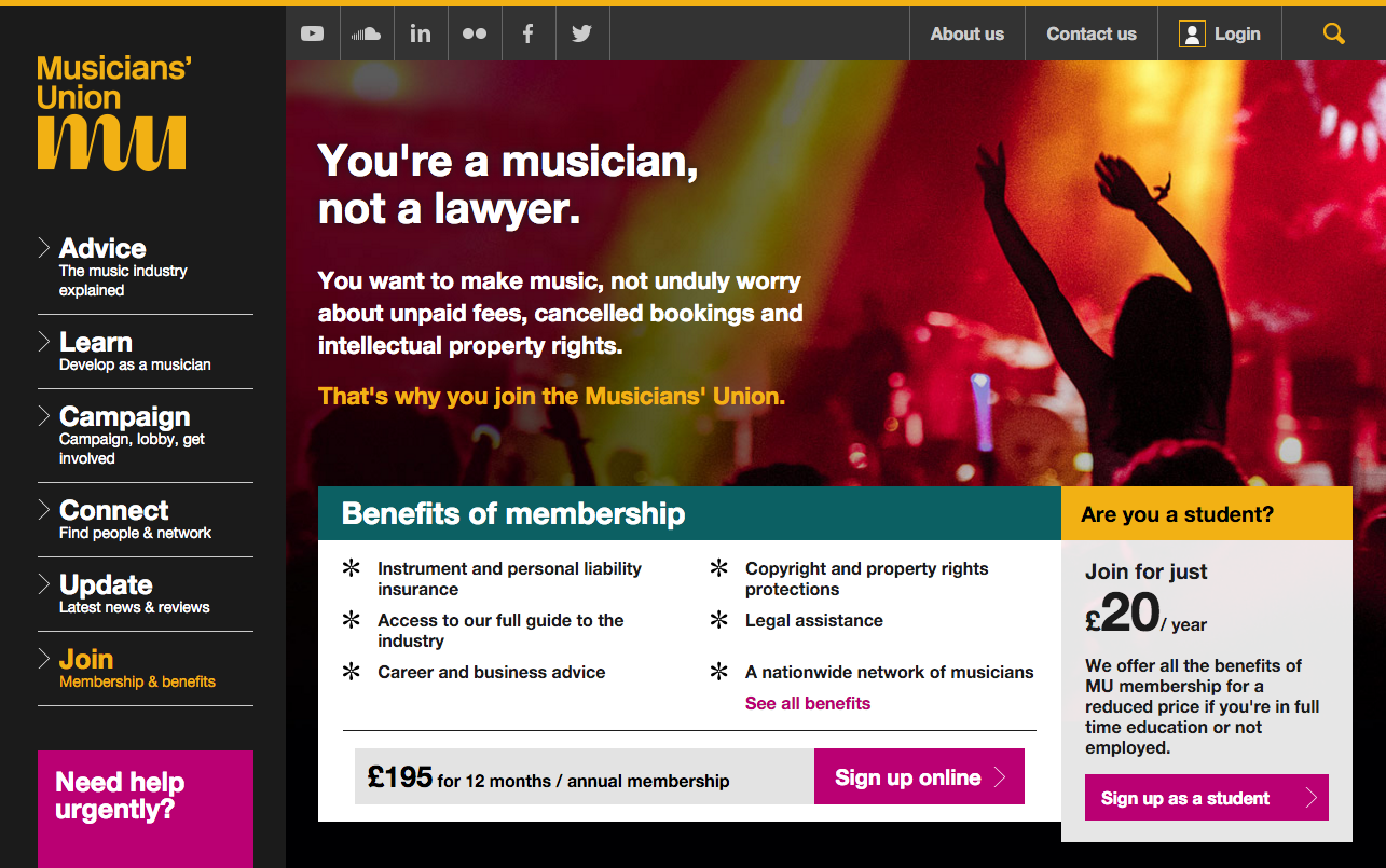
Using type and photography more confidently to match the print brand
In addition to this, web typography had progressed significantly since the previous site was built, and New Rail Alphabet (the MU’s brand typeface) was now available for use online.
To keep things consistent, we produced a series of responsive components, which were then used to create around 10 different page templates to accommodate the different types of content that the MU provide on their site.
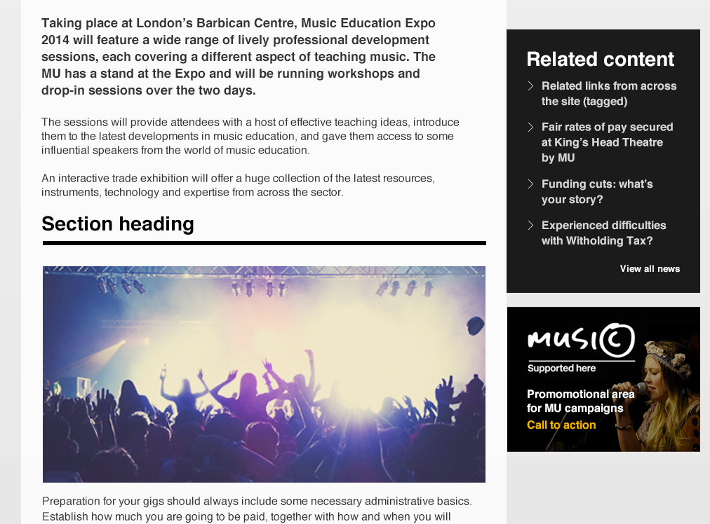
Examples of interface components
By combining component-based design with prototyping I was able to sit in meetings with our client, listen to their concerns about the site and directly explore solutions for these using the latest front-end code. This allowed for much faster decision making and realistic expectations for both parties of what we could achieve in code.
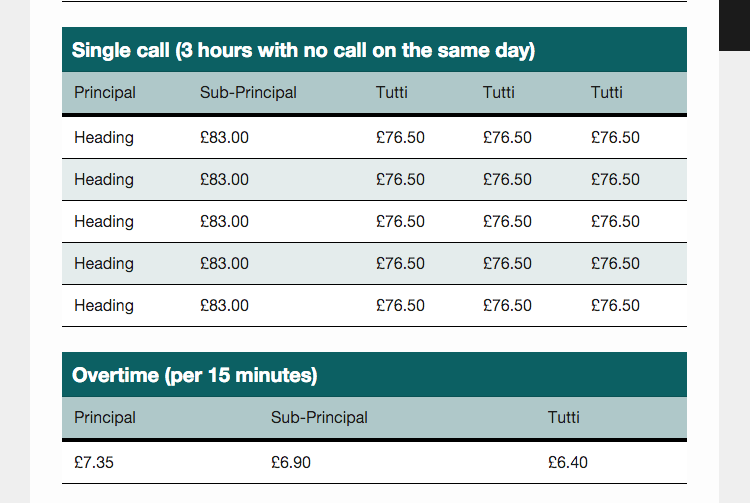
Components which we refined by deciding in-browser
