The challenge
Provide a refreshed, responsive website to go correspond with a new visual identity for the university.
The solution
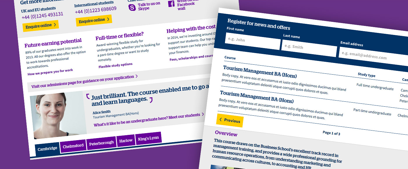
A component-based set of 6 page templates to cover the range of core content on the site, and allow the client to create further templates from a consistent, predefined visual language if necessary.

The process
My role on this project sat across design and front-end development, putting me in the privileged position where I could help inform design decisions knowing what was achievable in code.
Design
From early on in the rebranding process (also undertaken by Precedent) we discussed typeface choices, in which I was able to recommend that a typeface was chosen with web rendering in mind. This ensured that the visual identity being created would be consistent both online and off.

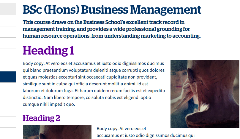
Using a combination of Stag and Source Sans to create a strong type heirarchy
As part of the brand work, suggested homepage and content page designs were created, but the full suite of templates was yet to be defined.
I sat down with one of the team’s UX architects to discuss the content required for each, and we quickly realised that various types of content were being used in multiple places across the site.

Based on this, I decided to tackle the remaining design work in a component-based fashion, using Photoshop’s linked smart objects to design once, and place in multiple files.
I used this method to design the 4 remaining page templates and update the initial designs where changes had cropped up as a result of brand development.
Front-end Development
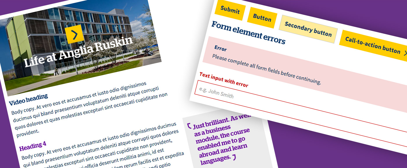
In a similar way to the design, the development process was very modular. Each component needed to be defined for use in a series of locations across the site, keeping a consistent visual appearance but accommodating different types of content based on its context.

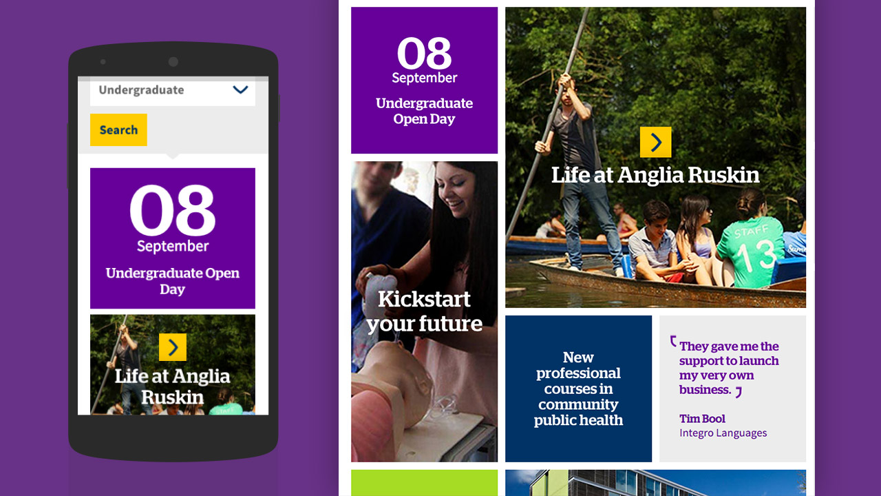
Components built to sit within a responsive grid to appear clearly on all devices
To do this, I approached the front-end development using Sass and a flexible grid system. This allowed me to define each component in a separate file to keep things easily maintainable, and to set up a series of media queries for each component to define specifically how it should behave in each context.
Once the main components were created and styled, I moved on to combining them into the required page templates and added Javascript-based interactions to match the designs.
To ensure crisp, fast rendering on mobile devices without affecting page weight, the majority of the image assets on the site are set up as SVGs with PNG fallback images to accommodate older devices.

