
As part of the University of Southampton’s latest ‘Ambition’ undergraduate recruitment campaign, they required a custom handwritten font. The campaign is based around applicants’, students’ and alumni’s personal ambitions and the fact that Southampton is the catalyst to achieving them. The font would be used to customise a brand lockup to create a variety of primary visual elements, with attendees at open days encouraged to complete their own ambitions.
The problem
Pick any cheap or free handwritten font off the shelf and chances are that it contains one of each glyph. Now that’s great for glyph coverage, but anyone with a keen eye will be quick to spot that repeated uses of the same letter look awfully similar.
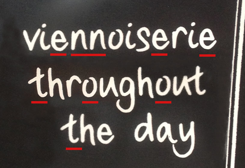
A selection of the repeated characters on a found sign. Nicely drawn, but the repetition gives the game away somewhat.
Now I don’t mean to rule out the possibility that some people could probably duplicate letters to this high standard, but myself? Not so much. I’m lucky if I can read my own handwriting at times, but the quality varies fairly considerably. Obviously for a real-world project it would be ideal if people could still read the lettering, (graphic design being all about communication and all that), but hopefully you get my point.
Rotation via contextual alternates
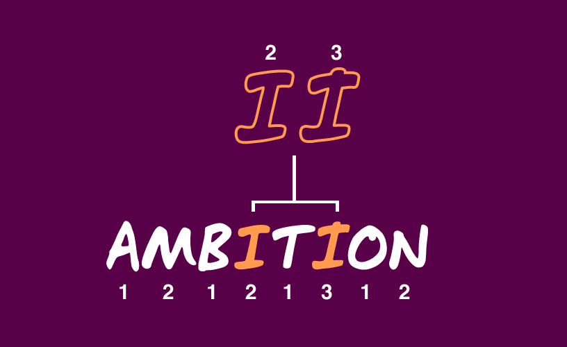
One way to overcome this repetition is to employ OpenType features to rotate the characters used. By drawing multiple sets of the glyphs in your font and using simple OpenType substitution, you can create a rotate which glyph set the characters you use come from. For example, if you had two sets, typing a word would look roughly like this:
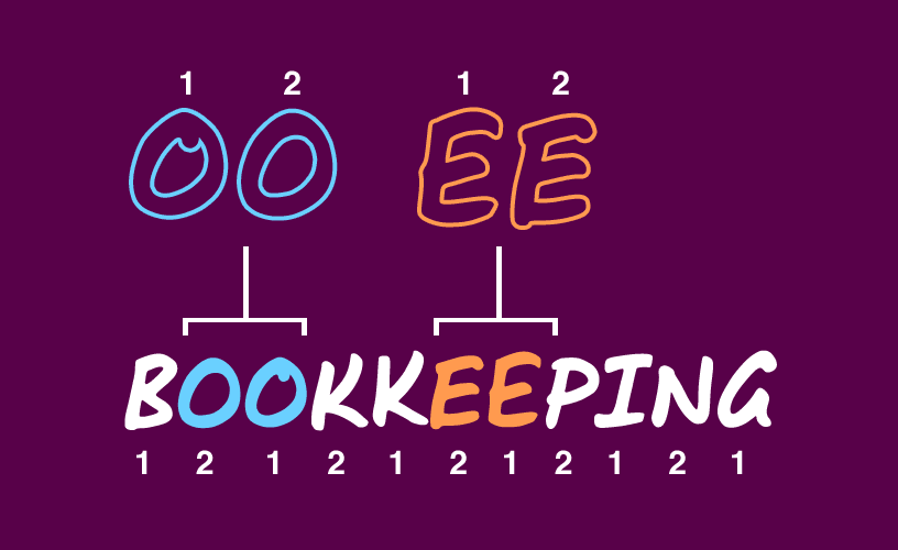
Substituting the second of a pair of double letters makes for more believable handwritten fonts
As you can see, this overcomes letters that are directly next to each other. (I have never been quite so proud of my work as when a project manager wandered over and said “…but it can’t be a font, the Bs aren’t the same.”) Mission accomplished (kind of). This is all very well, but in the process of developing the font this way I did find that there are a couple of pitfalls to watch out for with this method that caught me out on the way.
Firstly, if you try it with just two sets of glyphs, there is the risk that two of the same letter separated by one other put you right back where you started. This means that you either have to draw a third set (or fourth, fifth, sixth) to get it to look really convincing, or you need to conditionally substitute characters when this happens (more on this later).
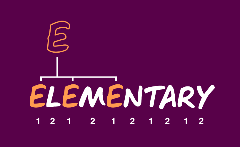
Mathematically, rotation leaves you open to repetition where a letter sits at the same place in a cycle.
Secondly, this involves drawing a lot of characters. We needed a full set of uppercase letters for the campaign, some basic punctuation and a set of numbers. Multiply that by the number of rotations you intend to include and it soon adds up. The other thing that caught me out in an early version was that spaces were resetting the rotation, so if I typed “as a”, I would end up with the same a, despite them being on differently numbered in the rotation sequence. When I said a full set of characters, I mean spaces too.
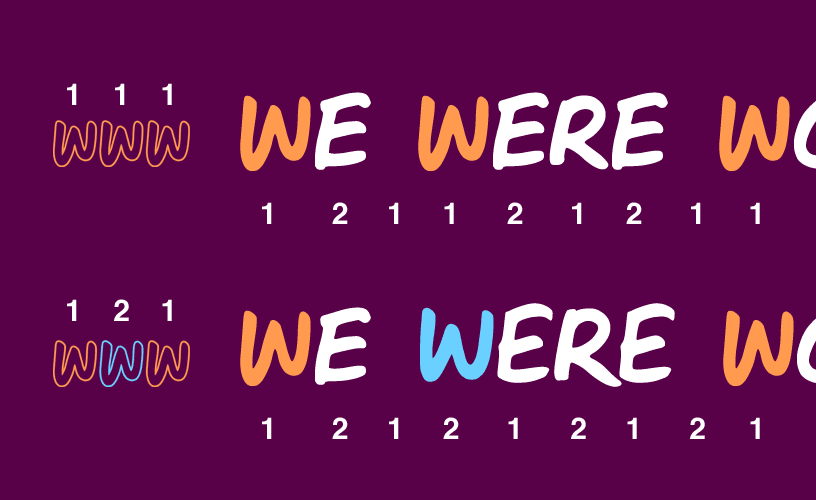
Watch out for missing alternate punctuation glyphs resetting your rotation. Remember your alternate spaces, people!
(For those who are interested, rotation takes the form of a class-based contextual alternate substitution, based on the class that the last glyph came from. Credit to this thread on Typophile for making it easier to grasp). Those cleverer than me have mentioned rotating glyphs based on looking back at the last form of that letter used and then swapping if it matches the one about to occur, but with my limited font engineering knowledge this is currently beyond my skillset.
Statistically this would make for much less chance of repetition so I’d love to know how that one works! That’s where this part of the story ends – at least as the case study part is concerned – but there are a couple of other methods that I’m keen to investigate.
Glyph substitution
Rotation is good, but natural handwriting has a tendency to follow certain patterns rather than rely on pure chaos. People might draw both stems of a double ‘t’ before crossing them in one stroke for example, or always join certain pairs of letters in the flow of writing. This is where glyph substitution would be ideal.
Ligatures
As you go about your day-to-day handwriting, there will inevitably be certain letter combinations that naturally lend themselves to joining as you write, be it for efficiency or style. Ligatures can be used stylistically – as opposed to functionally avoiding clashing letters, although this still applies – to simulate this. Certain pairs of letters look unnaturally forced and distracting if they are not joined, but unless your handwriting is particularly flamboyant, this probably isn’t the place for that triple-looped ‘st’ ligature you’ve always wanted to try out.
Fixing rotation
For those of us not in a situation where creating 5 or 6 rotating character sets for a font is appropriate and commercially viable, there is another way to avoid repetition. I have briefly toyed with the idea of factoring in some OpenType functionality that checks for an instance of a common letter in the same phase of rotation as the current letter, and if so, swaps out a glyph from a limited subset of the most frequently duplicated characters. I briefly had a proof of concept working, which looked something like this:
Contextual substitution rotation fix proof of concept
It didn’t make the final cut (see what I did there) of the font, but you’d be surprised how many words in English repeat characters within a one or two character distance.
The people who are inevitably schooling me at this
The Sketchnote Typeface was developed by Mike Rohde and Delve Withrington. Their approach was to hand-draw hundreds of individual glyphs and then meticulously craft them in software, keeping the subtle variations in stroke smoothness created by the paper that was used. This, combined with the vast quantity of alternate characters they’ve included per weight (oh yes, there’s not just one) give it a very rustic, welcoming feel.
Topping even that, the clever folk at Underware have this well and truly covered. Their case study documenting the 5-year production of Liza explains far better than I could hope to, and they even included an ‘out of ink’ function, varying glyphs depending on how many characters you have typed. Mind blowing stuff!
A word on web support
The final part of this task was to produce a web-friendly set of files and the accompanying CSS. Fontsquirrel have a brilliant webfont kit generator to do most of the legwork while providing fine-grained control over the output(s). The CSS properties needed to implement advanced OpenType features are becoming much more reliable in modern browsers. Elliot Jay Stocks has produced a series of posts on these features if you fancy more background reading, but my personal suggestions would be:
- If you’re using alternates, make sure you pay as much attention to kerning your standard character set as the alternate pairs, as these will be required in browsers without font-feature-settings CSS support.
- As much as text-rendering: optimizeLegibility is a bit of a performance nightmare, used sparingly on only the elements that use your webfont it appears to help reproduce your kerning and other font-features in certain browsers.
- If in doubt, get testing.